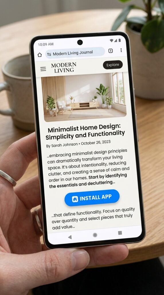
Gutenberg Block Guide: PWA Install Button
The PWA Install Button Gutenberg block is a core integration in Hyper PWA that allows site administrators to place fully customizable, interactive app installation triggers directly into post and page layouts using the WordPress Block Editor (Gutenberg).
Unlike static buttons, this block is built with PWA-awareness: it automatically handles installation state detection and only displays when the user’s browser is capable of installing the Progressive Web App.
⚙️ Step 1: Enable the Gutenberg Block
Before you can insert the block in the editor, you must enable it inside your plugin settings:
- Navigate to your WordPress Dashboard and go to Hyper PWA > Advanced.
- Locate the Gutenberg Block checkbox and ensure it is checked.
- Click Save Settings to apply your changes.
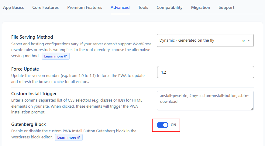
Enable Gutenberg Block option inside Advanced settings
🔍 Step 2: Locating the Block in Gutenberg
- Open the Gutenberg block editor on any Page, Post, or custom post type.
- Click the + (Toggle block inserter) icon.
- Search for “PWA Install Button” or browse under the Widgets block category.
- Click or drag the block to insert it into your layout.
🎨 Visual Customization Options
Once the block is inserted, selecting it exposes options directly inside the Gutenberg block wrapper and within the block settings sidebar (Inspector Controls):
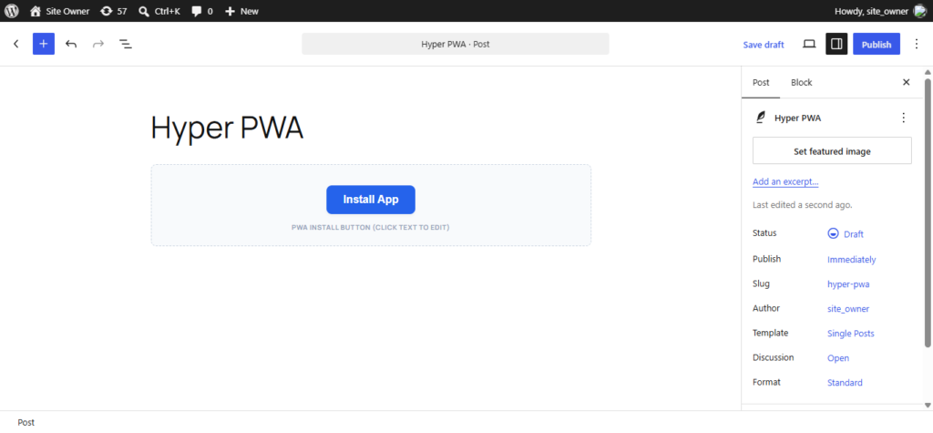
Gutenberg Block visual style editing panel
1. Direct Content Editing
- Inline Text Entry: Click directly on the button text inside the editor canvas to type your call-to-action (e.g. “Install App”, “Get our Mobile App”).
- Text Formatting: Supports inline styles like Bold, Italic, and Underline through the default RichText editor toolbar.
2. Layout & Alignment (Block Toolbar)
- Use the alignment options in the block toolbar to position the button:
- Align Left
- Align Center (Default)
- Align Right
3. Style Settings (Block Sidebar Panel)
With the block selected, the Inspector Sidebar on the right displays the Install Button Style Settings panel:
- Background Color: A visual color palette selector to define the button’s background hue.
- Text Color: A color palette selector to adjust text visibility.
- Border Radius: A slider (range:
0–50px) to adjust corner roundness—from sharp rectangles (0) to rounded pills (50). - Vertical Padding: A slider (range:
0–50px) to adjust vertical padding. - Horizontal Padding: A slider (range:
0–100px) to adjust horizontal spacing.
📱 Live Frontend Behavior
When your page loads, the button is initially hidden (display: none;) to prevent jarring visual shifts while PWA readiness is evaluated. The plugin’s client-side SDK (install-button.js) runs a sequence of checks:
- Environment Check: Confirms the browser is on a secure origin (
HTTPS) and supports PWA installation APIs. - Installation Status: Checks if the user is already browsing inside standalone/app mode or has already installed the PWA. If installed, the button remains hidden.
- Prompt Interception: Listens for the browser’s
beforeinstallpromptevent. When triggered, the script reveals the button smoothly. - Click Event Handler: When clicked, the button intercepts the default event, calls
.prompt()on the saved install event, and captures the user’s choices (Accepted / Dismissed) to track conversions.