
How To Create A Bottom Navigation Menu In Hyper PWA
Bottom Navigation is a premium feature of Hyper PWA that adds a fixed, thumb-friendly navigation bar to the bottom of the screen for quick access to key pages of your site. This is especially useful on mobile devices, giving your PWA a native app-like feel with persistent navigation across all key sections (Home, Categories, Search, Favorites, Profile, etc.).
Prerequisites
Before you can use the Bottom Navigation feature, you must:
- Upgrade to the Hyper PWA Premium version.
- Install and activate the Hyper PWA Premium plugin on your site.
- Confirm your site is set up as a working PWA with a valid manifest and service worker.
⚠️ Note: Bottom Navigation is a Premium-only feature. If you’re using the Free version of Hyper PWA, this section will not appear in your settings. Upgrading to Premium is required to unlock it.
Where to Find This Feature
Once Premium is active, go to:
Hyper PWA → Premium Features → Bottom Navigation
Toggle the feature ON using the switch at the top-right of the panel to enable the bottom navigation bar on your site.
Menu Items Configuration
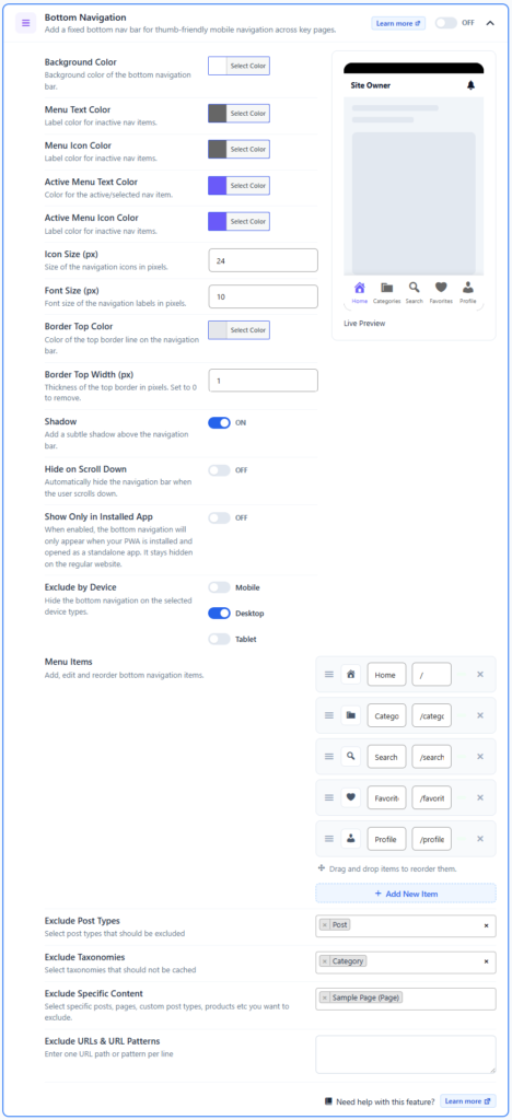
The core of this feature is the Menu Items repeater, where you define which links appear in the bottom navigation bar.
Fields Available for Each Menu Item
| Field | Description |
|---|---|
| Icon Selector | Choose an icon to represent the menu item (e.g., Home, Category, Search, Favorite, Profile icons). A preview of the selected icon is shown directly on the item row. |
| Name | The label displayed under the icon in the navigation bar (e.g., Home, Categories, Search). |
| Path | The relative URL the item links to (e.g., /, /category, /search, /favorite, /profile). |
Steps to Add / Edit Menu Items
- Go to Hyper PWA → Premium Features → Bottom Navigation.
- Scroll to the Menu Items section.
- Click + Add New Item to add a new navigation entry.
- For each item, set:
- Icon — click the icon box to open the icon selector and pick an icon.
- Name — e.g.,
Home - Path — e.g.,
/
- Use the drag handle (☰) on the left of each row to reorder items by dragging and dropping.
- Click the ✕ icon on a row to remove that menu item.
- The Live Preview panel updates automatically to reflect your changes.
- Click Save Changes once you’re satisfied.
💡 Tip: Keep your bottom navigation to 4–5 items maximum. Too many items make labels and icons cramped on smaller screens.
Styling & Customization Options
Beyond the menu items themselves, Bottom Navigation offers a wide range of styling and behavior controls:
Colors
| Option | Description |
|---|---|
| Background Color | Sets the background color of the entire bottom navigation bar. |
| Menu Text Color | Label color for inactive (non-selected) navigation items. |
| Menu Icon Color | Icon color for inactive navigation items. |
| Active Menu Text Color | Label color for the currently active/selected item. |
| Active Menu Icon Color | Icon color for the currently active/selected item. |
| Border Top Color | Color of the thin border line along the top edge of the navigation bar. |
Sizing
| Option | Description |
|---|---|
| Icon Size (px) | Controls the pixel size of navigation icons. |
| Font Size (px) | Controls the pixel size of the navigation labels. |
| Border Top Width (px) | Thickness of the top border in pixels. Set to 0 to remove the border entirely. |
Behavior
| Option | Description |
|---|---|
| Shadow | Toggle ON/OFF to add a subtle drop shadow above the navigation bar for visual separation from page content. |
| Hide on Scroll Down | When enabled, the navigation bar automatically hides as the user scrolls down and reappears on scroll up, maximizing content space. |
| Show Only in Installed App | When enabled, the bottom navigation only appears when the PWA is installed and launched in standalone mode — it stays hidden on the regular website in a browser tab. |
| Exclude by Device | Choose to hide the bottom navigation on specific device types: Mobile, Desktop, and/or Tablet, using individual toggles. |
Content Exclusion Rules
| Option | Description |
|---|---|
| Exclude Post Types | Select specific post types (e.g., Post) on which the bottom navigation should NOT be displayed. |
| Exclude Taxonomies | Select taxonomies (e.g., Category) on which the bottom navigation should be excluded. |
| Exclude Specific Content | Select individual posts, pages, or products (e.g., a specific Sample Page) to exclude from showing the navigation bar. |
| Exclude URLs & URL Patterns | Enter one URL path or pattern per line to exclude the bottom navigation from matching pages (e.g., /checkout, /cart/*). |
Frontend Result (End-User View)
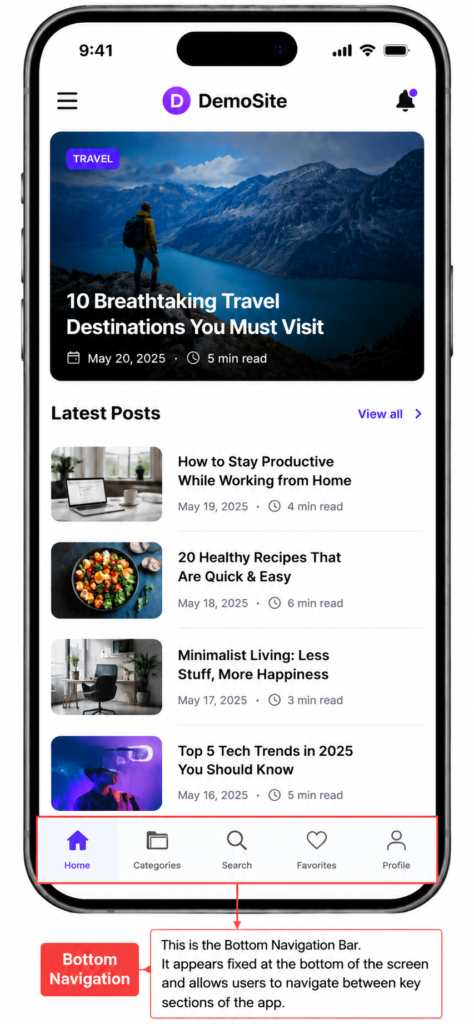
Once configured and saved, the bottom navigation bar appears fixed at the bottom of the screen across your site (subject to any exclusion rules you’ve set). Users can tap any icon/label to instantly jump to that section, with the active item visually highlighted using the Active Menu Text/Icon colors.
Frequently Asked Questions
Q: Why can’t I see the Bottom Navigation option in my admin panel? A: This feature is Premium-only. Confirm that you’ve purchased and activated the Hyper PWA Premium version.
Q: The navigation bar isn’t showing on my site even though it’s turned ON. A: Check the Exclude by Device, Exclude Post Types/Taxonomies/Specific Content, and Exclude URLs & URL Patterns settings — the current page or device type may be excluded. Also check if Show Only in Installed App is enabled, which hides it outside the installed PWA.
Q: How many menu items should I add? A: 4–5 items is recommended for the best fit and readability on mobile screens.
Q: Can I reorder menu items after adding them? A: Yes — use the drag handle (☰) on the left side of each Menu Item row to drag and drop items into the desired order.
Q: What happens if I set Border Top Width to 0? A: The top border line is completely removed, giving the navigation bar a borderless, flush appearance.