How To Configure The Initial Loader In Hyper PWA
The Initial Loader is an exclusive premium feature in Hyper PWA. This feature is not available on free plans and requires a premium subscription upgrade to access and use.
Overview
The Initial Loader is a premium feature in Hyper PWA that allows you to display a branded loader while your Progressive Web App loads for a native app-like experience. This feature enhances user experience by providing visual feedback during the app initialization process.
Accessing the Initial Loader Settings
- Navigate to your Hyper PWA Dashboard
- Verify you have Premium Status (check Account/Plan settings)
- Go to Premium Features
- Select Initial Loader
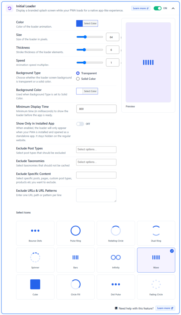
- You’ll see the configuration panel with all available options
Enabling/Disabling the Feature
At the top-right of the Initial Loader panel, you’ll find a toggle button labeled ON/OFF.
- Toggle ON: Activates the Initial Loader for your PWA
- Toggle OFF: Disables the feature
Configuration Options
1. Color
Description: Set the color of the loader animation elements.
How to Configure:
- Click the “Select Color” button
- A color picker will appear
- Choose your desired color (typically matching your brand)
- The color will be applied to the loader animation in the preview panel
Use Case: Maintain brand consistency by matching your app’s primary color.
2. Size
Description: Adjust the size of the loader in pixels.
How to Configure:
- Use the slider control or enter a value directly in the text field
- Current default value: 64 pixels
- Adjust the slider left to decrease size, right to increase size
- The preview updates in real-time as you adjust
Best Practice: Use 64px for most applications; larger sizes (80-100px) for HD displays, smaller sizes (48px) for compact layouts.
3. Thickness
Description: Controls the stroke thickness of the loader animation elements.
How to Configure:
- Use the slider control or enter a value directly in the text field
- Current default value: 6 pixels
- Slide to adjust the stroke width of animation elements
Best Practice:
- 4-6px for delicate, modern designs
- 8-10px for bold, prominent loaders
- Match the thickness to your app’s design language
4. Speed
Description: Controls the animation speed multiplier for the loader.
How to Configure:
- Use the slider control or enter a value directly in the text field
- Current default value: 1 (normal speed)
- Higher values = faster animation
- Lower values = slower animation
Recommendations:
- 0.8 – 1.2: Standard speed ranges
- 1.5+: Faster, energetic feel
- 0.5-0.8: Slower, more relaxed feel
5. Background Type
Description: Choose whether the loader screen has a transparent or solid color background.
Options:
- Transparent (recommended for web overlays)
- Default option
- The splash screen blends with your app’s background
- Better for apps with dynamic backgrounds
- Solid Color (recommended for native-like experience)
- Displays a solid color background behind the loader
- Creates a distinct splash screen
- More app-like appearance
How to Configure:
- Select the radio button for your preferred option
- If you choose “Solid Color,” the “Background Color” option becomes available
6. Background Color
Description: Set the background color for the splash screen.
When Available: Only enabled when “Background Type” is set to “Solid Color”
How to Configure:
- Click the “Select Color” button
- Choose your desired background color
- Typically, this should be your brand’s secondary color or a neutral shade
Best Practices:
- Light backgrounds: Use white or light gray (#F5F5F5)
- Dark backgrounds: Use dark gray or black (#1A1A1A)
- Ensure sufficient contrast with the loader color
7. Minimum Display Time
Description: The minimum time (in milliseconds) the loader will display before the app is ready.
Current Default: 800 milliseconds
How to Configure:
- Enter the desired milliseconds value in the text field
- Recommended range: 500-2000ms
Use Cases:
- 500ms: Quick apps, fast load times
- 800-1000ms: Standard for most applications
- 1500-2000ms: Slower connections, large file loads
- Prevents the loader from flickering if app loads too quickly
8. Show Only in Installed App
Description: Controls whether the loader appears only when the PWA is installed as a standalone app.
Current Status: OFF (disabled by default)
How to Configure:
- Toggle ON to show loader only in installed PWA
- Toggle OFF to show loader on both web and installed app versions
Use Case:
- Turn ON if you want a more “native app” feel for installed PWA only
- Turn OFF if you want consistent experience across all access methods
9. Exclude Post Types
Description: Select specific post types that should not display the loader.
How to Configure:
- Click “Select options…”
- A dropdown menu appears with available post types
- Select post types to exclude (e.g., drafts, scheduled posts)
- Selected post types won’t trigger the initial loader
Common Use Cases:
- Exclude draft posts
- Exclude preview pages
- Exclude specific custom post types
10. Exclude Taxonomies
Description: Select taxonomies that should not trigger the loader.
How to Configure:
- Click “Select options…”
- Choose taxonomies to exclude (categories, tags, etc.)
- Pages under excluded taxonomies won’t display the loader
Example: Exclude the “Blog” category if you don’t want the loader on blog pages.
11. Exclude Specific Content
Description: Manually exclude specific posts, pages, or custom post types from displaying the loader.
How to Configure:
- Click the text field
- Enter specific post IDs, page IDs, or custom post type identifiers
- One entry per line or comma-separated
Use Case: Exclude certain landing pages or special posts that load quickly.
12. Exclude URLs & URL Patterns
Description: Exclude specific URLs or URL patterns from showing the loader.
How to Configure:
- Click the text area
- Enter complete URLs or URL patterns
- One URL/pattern per line
- Supports wildcards for pattern matching
Examples:
/admin/*
/special-landing-page
https://yourdomain.com/checkout/*
Select Icons Section
The “Select Icons” section displays all available loader animation styles. Choose the animation that best matches your app’s personality.
Available Loader Icons:
- Bounce Dots – Three dots that bounce up and down
- Best for: Playful, modern apps
- Personality: Fun, approachable
- Pulse Ring – A circular ring that pulses in and out
- Best for: Professional, elegant apps
- Personality: Sophisticated, smooth
- Rotating Circle – A circle outline that rotates
- Best for: Technical, serious applications
- Personality: Professional, reliable
- Dual Ring – Two concentric circles rotating
- Best for: Premium, polished applications
- Personality: Modern, sleek
- Spinner – Traditional dashed circle spinner
- Best for: Standard applications
- Personality: Familiar, conventional
- Bars (Currently Selected) – Vertical bars that animate
- Best for: Contemporary, trendy apps
- Personality: Bold, energetic
- Infinity – An infinity symbol made of circles
- Best for: Continuous services, streaming apps
- Personality: Innovative, forward-thinking
- Wave – Bars that wave in sequence
- Best for: Fluid, dynamic applications
- Personality: Active, flowing
- Cube – Solid cube animation
- Best for: 3D-focused, technical apps
- Personality: Technical, powerful
- Circle Fill – Circle that fills progressively
- Best for: Progress-oriented apps
- Personality: Methodical, deliberate
- Dot Pulse – Dots that pulse in sequence
- Best for: Music or audio apps
- Personality: Rhythmic, engaging
- Fading Circle – Circle that fades in and out
- Best for: Minimalist apps
- Personality: Clean, refined
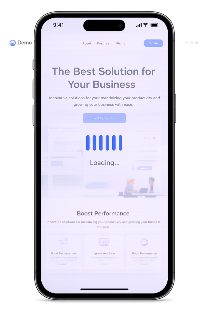
Preview Panel
Location: Right side of the configuration panel
Features:
- Real-time preview of your loader configuration
- Shows how the loader will appear to users
- Updates automatically as you change settings
- Displays the selected icon animation with your chosen color