How To Configure The Install App Popup In Hyper PWA
Hyper PWA → Premium Features → Custom Install App
🔒 Premium Feature Custom Install App is a premium-only feature. It is not available in the free version of Hyper PWA. To use this feature, you must purchase and install the Hyper PWA Premium plugin. Once the premium plugin is activated, this option becomes available under Hyper PWA → Premium Features → Custom Install App.
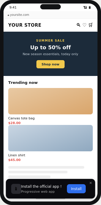
Custom Install App replaces the browser’s default “Add to Home Screen” install prompt with a fully branded, customizable install banner. Instead of relying on the browser’s generic prompt, you can control the title, message, icon, button text, position, colors, and display rules for your own install banner — giving visitors a consistent, on-brand experience when installing your Progressive Web App.
Enabling the Feature
- Purchase and install the Hyper PWA Premium plugin (this feature is not included in the free version).
- Go to Hyper PWA → Premium Features → Custom Install App.
- Toggle the feature switch at the top-right of the panel to ON.
- Configure the settings below and save your changes.
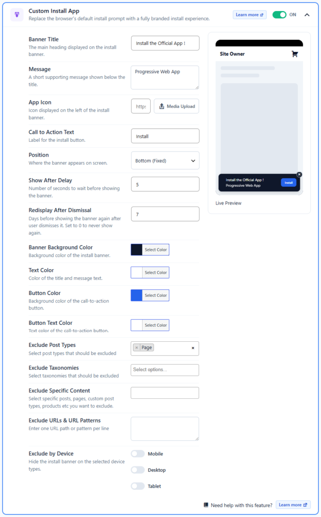
- Use the Live Preview panel on the right to see how the install banner will appear on your site before publishing.
Settings Reference & Detailed Analysis
Banner Title
The main heading displayed on the install banner (e.g., “Install the Official App!”).
- Purpose: This is the first thing a visitor reads, so it should immediately communicate value — why they should install the app rather than just browse the site.
- Best practice: Keep it short (under 40 characters) so it doesn’t wrap awkwardly on mobile screens. Action-oriented phrasing (“Install the Official App!”) tends to convert better than generic labels (“Add to Home Screen”).
- Tip: Avoid punctuation overload (e.g., multiple exclamation marks) — it can look spammy and reduce trust.
Message
A short supporting message shown below the title (e.g., “Progressive Web App”).
- Purpose: Provides context or a secondary value proposition — what the app is or what the user gets (faster access, offline use, notifications, etc.).
- Best practice: Use this line to reinforce a benefit rather than repeat the title. For example, instead of “Progressive Web App,” something like “Faster access, no app store needed” gives the user a reason to act.
- Tip: Keep it to one line; the banner has limited vertical space, especially on mobile.
App Icon
The icon displayed on the left of the install banner. Set via a direct HTTPS URL or the Media Upload button.
- Purpose: Builds brand recognition and trust — a real logo instead of a generic browser icon makes the prompt feel like a legitimate part of your brand rather than a browser pop-up.
- Best practice: Use a square image (e.g., 96×96px or 192×192px), ideally the same icon used in your PWA manifest, so it’s visually consistent with the installed app icon.
- Tip: Use the Media Upload option instead of a raw URL where possible — hosting the icon in your Media Library avoids broken images if an external URL changes or goes down.
Call to Action Text
The label on the install button (e.g., “Install”).
- Purpose: Drives the actual conversion action. This is the single word/phrase users click to trigger installation.
- Best practice: Short, direct verbs work best — “Install,” “Get App,” “Add Now.” Avoid vague text like “Click Here” or “Learn More,” which don’t convey that clicking installs the app.
- Tip: Match the tone of the button text to the title/message so the CTA feels like a natural next step, not a disconnected label.
Display Behavior
Position
Where the banner appears on screen (e.g., Bottom (Fixed)).
- Purpose: Determines visibility and how intrusive the prompt feels. A fixed bottom banner is persistent but non-blocking, letting users continue browsing while still seeing the prompt.
- Best practice: Bottom-fixed is generally best for mobile-first sites since it mirrors native app install banners and doesn’t obstruct the header/navigation. Top or centered/modal positions (if available) are more attention-grabbing but can feel intrusive.
- Tip: Test on both mobile and desktop breakpoints — a position that works well on a phone screen may overlap content on desktop.
Show After Delay
Number of seconds to wait after page load before the banner appears.
- Purpose: Prevents the prompt from appearing before a visitor has had a chance to engage with the content, which can hurt first impressions and increase bounce rate.
- Best practice: A delay of 5–10 seconds (or triggering after scroll/engagement, if supported) usually balances visibility with user experience — long enough that the visitor has seen value, short enough that the prompt isn’t missed.
- Tip: Very short delays (0–2s) can feel aggressive and drive dismissals; very long delays (30s+) risk the user leaving before ever seeing the prompt.
Redisplay After Dismissal
Number of days before the banner reappears after a user dismisses it. Set to 0 to never show it again after dismissal.
- Purpose: Balances persistence (encouraging installs) against annoyance (repeatedly nagging users who’ve already said no).
- Best practice: 7 days is a reasonable default — long enough to avoid irritating repeat visitors, short enough to give installation another chance. E-commerce or content sites with frequent return visits may prefer 14–30 days.
- Tip: Setting this to 0 is useful if you want a “one-shot” prompt — respectful of user choice, but you lose the opportunity to re-engage users who dismissed it accidentally or changed their mind later.
Appearance
Banner Background Color
Background color of the install banner.
- Purpose: Sets the visual tone and ensures the banner matches your site/brand identity rather than looking like a generic system dialog.
- Best practice: Use a color from your brand palette with enough contrast against the page background so the banner stands out (dark backgrounds like near-black or brand primary colors tend to perform well for visibility).
Text Color
Color of the title and message text.
- Purpose: Readability. This must contrast sufficiently against the Banner Background Color.
- Best practice: Follow accessibility contrast guidelines (WCAG AA: at least 4.5:1 contrast ratio for normal text) — e.g., white or light gray text on a dark banner background.
Button Color
Background color of the call-to-action button.
- Purpose: Draws the eye to the primary action. The button should visually “pop” against the banner background.
- Best practice: Use a contrasting accent color (e.g., a bright blue or brand accent) rather than a color close to the banner background — this is the single most important visual element for conversion.
Button Text Color
Text color of the call-to-action button.
- Purpose: Ensures the CTA label is legible against the Button Color.
- Best practice: Pair light text (white) with darker/saturated button colors, or dark text with light/pastel button colors — again following contrast accessibility guidelines.
Exclusions & Targeting
Exclude Post Types
Select post types (e.g., Page) where the banner should not appear.
- Purpose: Prevents the install prompt from showing on content types where it may be irrelevant or disruptive — e.g., legal pages (Privacy Policy, Terms), checkout flows, or admin-facing pages.
- Best practice: Commonly excluded: Pages (especially legal/utility pages), and any custom post type used for internal or transactional content rather than general browsing.
Exclude Taxonomies
Select taxonomies (categories, tags, custom taxonomies) to exclude.
- Purpose: Gives finer control than post type alone — e.g., hide the banner across an entire product category or blog tag that isn’t a good fit for app promotion (such as a “Support” or “Documentation” category where users need distraction-free access to information).
Exclude Specific Content
Select individual posts, pages, custom post types, or products to exclude.
- Purpose: Handles one-off exceptions that broader post type/taxonomy rules can’t capture — for example, a single high-conversion landing page where you don’t want any competing prompts.
- Tip: Use this sparingly for exceptions; rely on post type/taxonomy exclusions for broader patterns to keep maintenance simple.
Exclude URLs & URL Patterns
Enter one URL path or pattern per line to exclude matching pages.
- Purpose: The most flexible exclusion method — useful for excluding entire sections of a site (e.g.,
/checkout/*,/account/*) that aren’t tied cleanly to a post type or taxonomy, including dynamically generated or non-CMS-managed URLs. - Best practice: Use wildcard patterns (if supported, e.g.,
/wp-admin/*,/cart/*) to cover whole sections rather than listing every URL individually.
Exclude by Device
Toggles to hide the banner on Mobile, Desktop, or Tablet.
- Purpose: PWA installability and user behavior differ significantly by device. Mobile users benefit most from install prompts (home-screen access, app-like experience), while desktop users may find them less relevant or more disruptive depending on the site’s use case.
- Best practice: Many sites choose to show the banner only on Mobile and Tablet, excluding Desktop, since desktop users are less likely to “install” a PWA in the same behavioral sense as mobile home-screen installs. Adjust based on your analytics on where installs actually convert.
Notes
- All fields update the Live Preview in real time, allowing you to fine-tune branding before publishing changes live.
- Exclusion settings (post types, taxonomies, specific content, URLs, devices) can be combined to precisely control where the custom install banner is shown.
- This feature requires an active Hyper PWA Premium license. If the toggle or settings are not accessible, verify that the premium plugin is installed and activated.